


Have you ever picked out the perfect paint colour, only to see it look completely different once it’s on the wall? You’re not imagining things—lighting plays a huge role in how colours appear. Understanding how different types of light interact with paint can help you avoid surprises and ensure your space looks exactly how you envisioned.
Let’s break it down and look at how both interior and exterior lighting can influence your paint colours.
Natural Light: The Game Changer
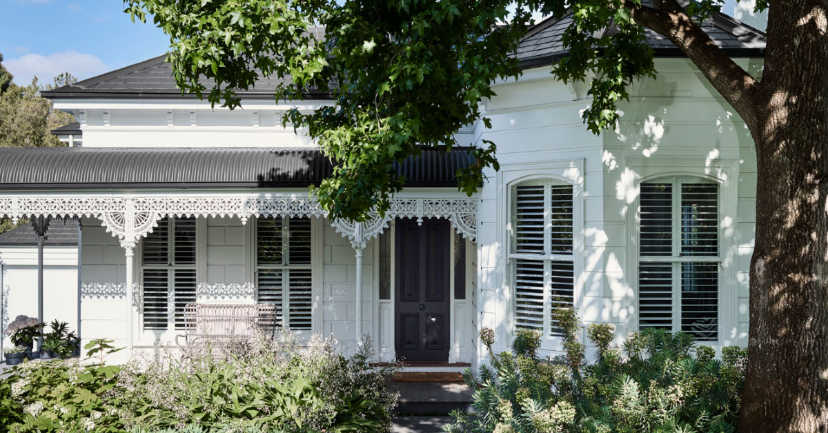
Natural light changes throughout the day, which means your paint colour can look different from morning to night. It also depends on which direction your home faces.
- North-facing rooms: Get cool, indirect light, which can make colours appear darker and even a bit bluer. Warmer tones can help balance this.
- South-facing rooms: Receive plenty of warm light all day, which makes colours look brighter and more vibrant. Softer shades can help prevent an overpowering effect.
- East-facing rooms: Morning light is warm and golden, but as the day progresses, these rooms cool down and become shadowy. Warm colours thrive in these spaces.
- West-facing rooms: The opposite of east-facing rooms—cool light in the morning, followed by warm, golden hues in the afternoon. Be mindful of how intense the colour appears later in the day.
How to Get It Right
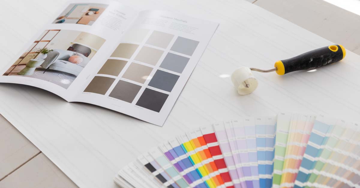
- Always test paint swatches at different times of the day.
- Paint a sample on multiple walls to see how shadows and reflections impact the colour.
- Consider your window treatments—heavy curtains or tinted windows can alter the light.
Artificial Light: Setting the Tone
When the sun goes down, artificial light takes over, and that’s when things can change dramatically. The type of bulb you use affects the way paint appears.
- Warm white (incandescent or warm LEDs): Enhances warm tones like beige, cream, and reds but can dull cool blues and greens.
- Cool white (fluorescent or cool LEDs): Makes whites crisper and blues brighter but can make warm tones feel washed out.
- Daylight bulbs: Mimic natural daylight and tend to be more neutral, giving a more accurate colour representation.
How to Get It Right
- If you mostly use artificial lighting, test your paint colour at night with the lights on.
- Think about the function of the room—warmer lighting creates a cosy feel in living areas, while cooler lighting is better for task-oriented spaces like kitchens and offices.
- Layer your lighting with lamps, overhead fixtures, and accent lights to balance out any extreme tones.
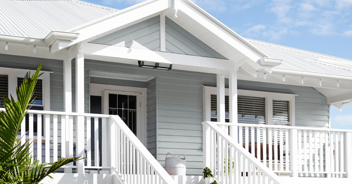
Exterior Paint & Lighting: A Whole Different Ballgame
Exterior paint is exposed to natural light all day, but it’s a different story than inside because outdoor light is much stronger.
- Direct sunlight: Makes colours look much lighter and brighter than they do on a sample card. Dark colours can also fade faster over time.
- Shade: Can make colours look cooler and sometimes even duller. A colour that looks bright in the sun might appear flat in the shade.
- Streetlights and exterior lights: Warm-toned bulbs (like yellow streetlights) can make whites look creamier and change the overall undertone of your colour.
How to Get It Right
- Always test exterior paint in full sunlight and shade to see how it shifts.
- Consider the surrounding environment—greenery, neighbouring houses, and even your driveway can reflect onto your home and change the way the colour looks.
- Matte finishes absorb light and reduce glare, while glossier finishes reflect light and can make colours appear more intense.
Final Tips for Choosing the Right Colour
- Don’t rely on small paint chips. They’re helpful for initial selection, but always test bigger patches on your walls.
- Think about how the room will be lit most of the time. If it’s mostly used in the evening, artificial lighting will be the biggest factor.
- Consider undertones. A grey with a cool undertone might look blue in certain lights, while a warm grey might shift towards beige.
- Check your furniture and decor. The colours in your home—couches, floors, even rugs—can reflect onto the walls and alter how they appear.
Lighting is a game-changer when it comes to paint. Taking the time to understand its effects will help you get the colour just right the first time. So, before you commit to that perfect shade, test it under different lighting conditions—you’ll thank yourself later.


INSPIRING YOUR NEXT PROJECT

GET THE GUIDE
Callan Paining offers a specialist painting and decorating service. Led by Davie, a proud third generation painter, alongside a skilled team, you could say paint is in our blood. Download our guide to learn more about Callan Painting and Decorating.
A creative approacH, combined with a deep care for every customer and their vision is at the heart of what we do.
Get to know us better. Learn how we can work together on your next project.
LET'S GET ACQUAINTED

© Callan Painting 2024 | All rights reserved
Privacy Policy | Terms + Conditions
Site Design Seed Creative
© Callan Painting 2024 | All rights reserved | Privacy Policy | Terms + Conditions | Site Design Seed Creative
